 +1(929) 203-4191
 info@logodesigncreators.com
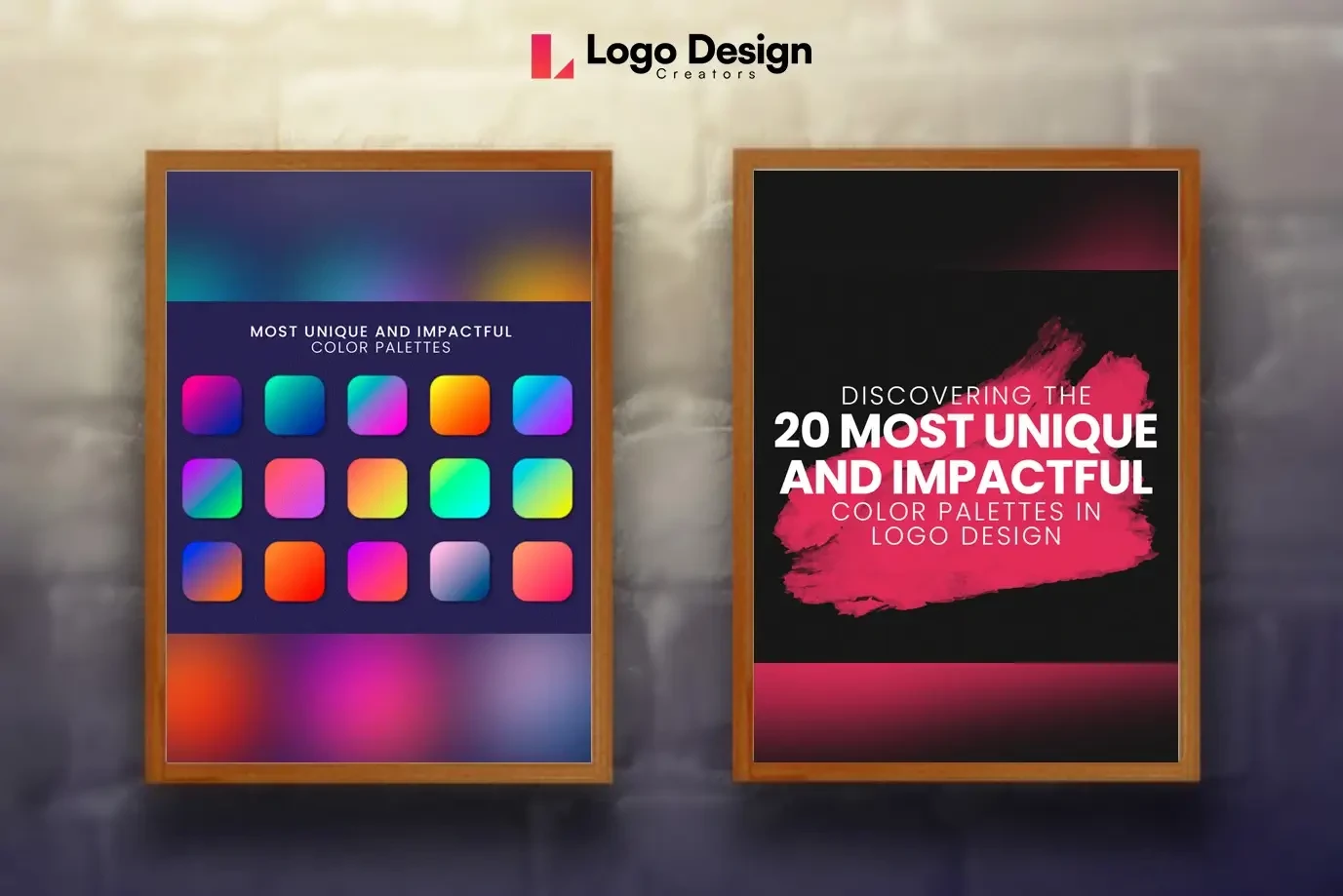
Discovering the 20 Most Unique and Impactful Color Palettes in Logo Design
?Color is a powerful tool in graphic design, and nowhere is this more evident than in the creation of logos. A well-chosen color palette can communicate a brand's personality, evoke emotions, and leave a lasting impression. So, we will explore the 20 most unique and impactful color palettes that graphic designers use to craft memorable logos and the logo color psychology behind each.
Here Are the 20 Most Unique and Impactful Color Palettes in Logo Design
Monochromatic Magic
Utilizing variations of a single color creates a sleek and sophisticated look, providing unity and simplicity to a logo. Examples include shades of blue, green, or red. Monochromatic palettes convey simplicity, professionalism, and a sense of order. The use of a single color suggests focus and a clear brand identity.
Analogous Harmony
Choosing colors that are adjacent to the color wheel creates a harmonious palette. This technique often results in warm or cool color schemes that are visually pleasing. Analogous colors create a harmonious and soothing effect. This palette is often associated with balance, unity, and a friendly brand personality.
Complementary Contrast
Employing colors that are opposite each other on the color wheel creates a high-contrast, dynamic effect. Think of red and green, blue and orange, or purple and yellow. Complementary colors create a high contrast that grabs attention. This palette is dynamic and energetic, representing balance and harmony through opposing forces. Logo Design Creators offer the best logo design service and ensure to cater to clients by providing them with details and meaning of all palettes.
Triadic Brilliance
Selecting three equidistant colors on the color wheel produces a vibrant and balanced palette. This approach is excellent for creating lively and engaging logos. Triadic palettes are vibrant and balanced, suggesting diversity and creativity. The combination of three colors creates visual interest without overwhelming the viewer.
Split-Complementary Drama
Similar to the complementary scheme but less intense, this palette involves a base color and two adjacent to its complementary color. This provides contrast without overwhelming the senses. This palette provides contrast while maintaining a degree of harmony. It's bold but not as intense as a complementary scheme, striking a balance between dynamism and stability.
Tetradic Richness
Incorporating two sets of complementary colors, this palette allows for a wide range of color combinations. It's versatile but requires careful balancing to avoid visual chaos. Tetradic palettes offer a wide range of colors, representing versatility and complexity. It suggests a brand that is dynamic, diverse, and capable of adapting to various situations. A power logo will follow the color story of the logo design provided by the client.
Double Split-Complementary
Combining two pairs of complementary colors creates a complex and visually interesting palette. It's a bold choice that can make a logo stand out. This complex palette implies a brand that is multifaceted and able to balance contrasting elements. It's attention-grabbing and ideal for brands that want to stand out.
Neutral Elegance
Employing neutral colors such as grays, whites, and blacks exudes sophistication and timelessness. This palette is often used for luxury brands and minimalist designs. Neutrals exude sophistication, timelessness, and a sense of calm. This palette is often associated with luxury, simplicity, and a focus on quality.
Pastel Serenity
Soft, muted pastels create a gentle and calming effect. This palette is popular for brands targeting a youthful or feminine audience. Pastels are soft and gentle, conveying a sense of innocence and serenity. This palette is often used for brands targeting a youthful or feminine audience.
Bold Primary Colors
Drawing from the primary colors (red, blue, and yellow) creates a bold and eye-catching palette. It's a classic choice that is often associated with strong and energetic brands. Primary colors are bold, strong, and energetic. They convey a sense of confidence, simplicity, and straightforwardness.
Nature-Inspired Hues
Utilizing colors found in nature, such as earthy greens, browns, and blues, connects a brand with the environment and conveys a sense of authenticity. Earthy tones suggest authenticity, reliability, and a connection to the environment. This palette is often used by brands that want to convey a natural and grounded image.
Also Read:
1) What Are The Do's and Don'ts to Hire a Logo Designer?
2) Explore the World of Various Logo Designs
Sunset Warmth
Embracing the warm tones of a sunset, including oranges, pinks, and purples, creates a visually striking and emotionally resonant palette. Warm sunset colors evoke feelings of warmth, passion, and energy. This palette is ideal for brands that want to convey a vibrant and positive image.
Oceanic Tranquility
Inspired by the colors of the ocean, this palette features various shades of blues and greens, conveying a sense of calm, trust, and reliability. Blues and greens associated with the ocean evoke feelings of calmness, trust, and reliability. This palette is suitable for brands that want to establish a sense of peace and stability.
High-Tech Futurism
Metallics, electric blues, and sleek blacks convey a futuristic and cutting-edge vibe. This palette is often used for tech and innovation-focused brands. Metallics and futuristic blues convey innovation, modernity, and a cutting-edge approach. This palette is often chosen by tech and forward-thinking brands.
Vintage Nostalgia
Drawing inspiration from retro color schemes, vintage palettes evoke a sense of nostalgia and authenticity, making them ideal for brands with a classic or timeless appeal. Vintage colors evoke nostalgia and a sense of tradition. This palette is ideal for brands that want to communicate a classic, timeless, and authentic image.
Whimsical Pops of Color
Using a neutral base with pops of bright, vibrant colors adds a playful and modern touch. This palette is particularly popular in industries targeting younger audiences. Neutral bases with pops of color suggest a playful and modern brand personality. This palette is often used by brands targeting a younger audience.
Gradient Extravaganza
Incorporating gradients allows for a smooth transition between colors, creating depth and dimension. This modern approach is well-suited for contemporary and dynamic brands. Gradients add depth and dimension, suggesting a brand that is dynamic, evolving, and modern. This palette is often used in contemporary and creative industries.
Watercolor Dream
Mimicking the soft, blended effect of watercolors creates a unique and artistic palette. It's an excellent choice for brands seeking a handcrafted and personalized feel. The soft, blended effect of watercolors communicates artistry, creativity, and a personal touch. This palette is ideal for brands that want to convey a handcrafted and unique image.
Minimalist Black and White
Stripping away color to focus on the contrast between black and white creates a clean, sophisticated, and timeless look. This palette is popular in minimalist and high-end branding. Stripping away color to focus on black and white suggests simplicity, sophistication, and timelessness. This palette is often used in minimalist and high-end branding.
Cultural Fusion
Blending colors inspired by different cultures creates a diverse and inclusive palette. This approach is well-suited for brands that celebrate diversity and global perspectives. Blending colors from different cultures communicates diversity, inclusivity, and a global perspective. This palette is chosen by brands that want to celebrate cultural richness and connect with a diverse audience.
Final Words
All companies that offer graphic design services know that color palettes play a pivotal role in shaping the identity and perception of a brand. The 20 unique and impactful color palettes discussed above showcase the versatility and creativity that graphic designers employ to craft logos that leave a lasting impression. Whether evoking nostalgia, conveying modernity, or celebrating diversity, the right color palette can elevate a logo from a visual element to a powerful symbol of a brand's essence.